Monday, December 12, 2011

Thursday, December 8, 2011
Textual analysis of the magazine MIXMAG
The publisher of MIXMAG is Development Hell Ltd.
ANALYSIS OF THE FRONT COVER:

The title of the magazine I’m looking at is a MIXMAG. It talks about clubs and music that’s played in there and DJ’s who create it, thefore it comes from the word “mixing” I presume, because music in the clubs is usually mixed.
The front cover of this magazine is very bright and colourful, and this issue has an illustration as the background picture on its front cover. Babycrow illustrated SKRILLEX(Sonny Moore). Sonny Moore is the 23-year-old US dubstep phenomenon who’s come from an emo background to become the biggest noise in the game.
The colour palette of the front cover is yellow, white and red, however the title of the magazine is done in white and therefore it perfectly stands out on the red background. Its strap line says that it is “THE WORLD’S BIGGEST DANCE MUSIC AND CLUBBING MAGAZINE”
Cover lines are created in two different styles and design, the biggest cover line is about “SKRILLEX and the U.S. DUBSTEP EXPLOSION!” its positioned in the middle of the page to attract attention. The rest of the cover lines have different fonts and a little variety of sizes. Cover lines have a black background to create a contrast with white and yellow. The front cover seems to be filled in because of the variety of colours and the amount of cover lines, there are quite many of them. Another attention-grabbing cover line “MASSIVE XMAS AND NEW YEAR’S EVE PARTY GUIDE”, its placed in a yellow circle and has a big font, this cover line aroused my curiosity and later on, I will be looking at it in order to analyse it as a double spread page for my textual analysis.
The price (£4.20) of the magazine is placed at the bottom of the front cover near the barcode, below it, it says the issue details (December 2011)
Its important to mention that a CD goes with this magazines and its stuck to the front cover so people can see it when they are looking at this issue in the shop. MIXMAG presents SASHA on this CD, and I believe it’s a good way of advertising new singers, albums or music type, etc.

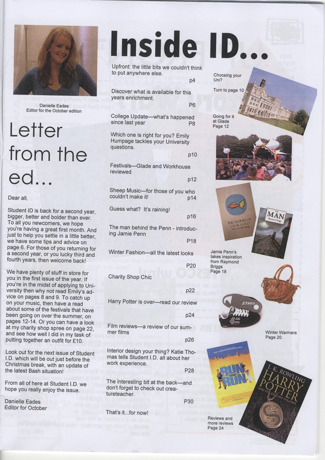
This page reflects the atmosphere of clubbing; it’s very dark as it has black background and it has a photo from one of the clubs in the centre of the page, which shows the atmosphere of a club life. There is also a page number on this picture and a little cover line “Don’t stay in : your club guide”.
At the top of the page there is the masthead of the magazine “mixmag” then is says the issue details “December 2011” and then with the bigger font it says “CONTENTS”. Different fonts are being used for each of the headline, however this font designs are typical for this magazine as they are seen very often.
There is only one column with all the contents on it. On the right side there are 24 cover lines which tell the audience what this issue is about and what each article is about, there are number of pages placed right next to the cover lines and its making it easier for the audience to find the article that they are looking for. It’s important to mention that there is another page with the contents, it has the same design as the first one, however the first one has a contents page for only one section VIP as its more interesting and important to show to the readers. On the second page there are few sections “features”, “fashion”, “tunes”, “don’t stay in”. This magazine doesn’t only talk about clubbing music, it also talks about different things that might be connected to it, like fashion or new places.
At the bottom of the page there is information about the free CD that goes with the magazine “SASHA”. It talks about the DJ and his career and also about his latest album. There are two small columns at the left bottom side which talks about him and his album, and on the right there are three columns with the list of all the songs from the CD that goes with the magazine.
At the very bottom of the page in the left corner it says the online version of this magazine www.mixmag.net and on the right it says the issue details and the page number.
ANALYSIS OF THE DOUBLE SPREAD PAGE:
This is the double spread page about all the clubs and parties, which will be held on the NYE. The title of the article is “THE BEST NYE EVER” which gives away what this article is going to be about from the beginning. This title has a big size and it stands out from the bright background and it attracts readers’ attention. Also its style has been used before on the front cover and on different titles. However, this is not the only thing which is attention-grabbing on this page, its background is a collage of photographs from clubs which was edited in the photoshop, its very bright and its color palette is red and yellow. The collage takes the most place on the double spread page.
There is a small yellow line with black font, which lists all the people who took part in creating this article.
There is a black bubble on the first page, which introduces the article and gives a brief summary of it. Another red bubble is on the second page and it represents a small cover line as it guides the reader to the page number 108 where there is an advanced listing of Christmas and NYE parties.
Columns are placed at the bottom and at the top of both pages to make more space for the collage. The columns are small, and each of them talks about one particular party. There are two headings of each column: the country where it is and then with the smaller font the name of the party and the city where its going to be held. At the bottom of each column there is a price of the event and the website of it.
Its important to mention that there is a continuation of this double spread as there is another page, however it talks about the rest of the world, cities like New York or Singapore.
Monday, December 5, 2011
Comparing music magazines

- UNCUT
- THE CLASH
- CLASSIC ROCK
- Q
In order to compare them, I've looked at their prices and Q turned out to be the cheapest one(£3.99). I've also looked at different sections of the magazines and most of them had two sections: features and regulars, however the magazine "THE CLASH" has only one section because this magazine talks only about one band - "the clash". It's important to notice that this magazine has been created by the makers of UNCUT. Most of the music magazines I've looked as have a lot of advertisement, however, most of ads are about music or something that is closely connected to it(e.g. speakers). Typical articles are usually about some artists, or some band. The editors tried to create good attention-grabbing headlines, for example :
"COLDPLAY: 'WE'RE THE BEST FUCKING BAND IN THE WORLD...' "
Action plan of the main task
12.12.11 - textual analysis(3 front covers, 2 contents, 2 DPS), audience research(poll,questionnaire,theory)
Christmas Holiday:
research+plan
2.1.12 - internet research (institutions, readership, figures)
9.1.12 - plan photoshoot, take photos
16.1.12 - layout design, masthead design
Making pages:
23.1.12
30.1.12
6.2.12 - make pages
Half-term evaluation:
20.7.12 - drafting
27.2.12 - audience feedback, evaluation
DEADLINE: 2.3.12.
preliminary task feedback
- I should be more careful with presentation, because some of the posts are oddly spaced.
- Show more evidence of drafting and more explanation of how I did things on the main task.
- Keep my production work on a high level.
- My written English could be improved.
Friday, December 2, 2011
Evaluation of my media product
- In what ways does your media product use, develop or challenge forms and conventions of real media products?
The key ingredient of student magazine is of course the front cover page. It attracts the target audience. The picture used on the front cover must be attention-grabbing, interesting and good quality. Usually it’s a mid close up portrait picture of someone significant and who would be mentioned in the magazine later on (the headmaster, new member of staff, head of boys/girls boarding, etc).
Title is another important part of creating a student magazine. It must suit the target audience and usually student magazines have a title which is somehow connected to the name of the school, some of my classmates tried to connect the title of their student magazine with the name of our school – St. Edmunds College. One of the magazines was called the “Edmundians”. I, however, decided to create a title that will not directly speak of the college or students, I used an abstract title “INSIDE” and I believe it arouses teenagers’ curiosity because by looking at my front cover and my title you cannot state that this is a student magazine. Some students have a stereotypical opinion about student magazines, which they are boring, colourless, and only teachers are interested what is inside of it. I decided to destroy this prejudice. My magazine was created strictly for students, it talks about their interests, it doesn’t talk only about school and school life, I looked outside the box in order to find what people of my age might be interested in.
Therefore my front cover looks nothing like the front covers of most of the student magazines and I have decided to go against conventions, I wanted to try if that would make students read school magazines more often.


- • How does your media product represent particular social groups?
My target audience are the people of my age, teenagers 15-18 years old. As this magazine would be published in our college I considered student’s background as well. People who go to our school are interested in culture and art, therefore I considered their interested and made my front cover and contents page very creative. I took a picture of a head of boy’s boarding, Ivan Wu because he is the head of boys society in boarding and he plays an important role in our school. Also the fact that he is a student will also attract the target audience because everyone knows him and people would be interested to read an article about him. I have used a colloquial language because it suits my target audience. I tried to create attention-grabbing cover-lines that would attract my audience and reflect their interests. I created a positive and creative presentation of teenagers, because students from our school like being extraordinary and different from others, however my presentation of a head of boy’s boarding was non-stereotypical because he doesn’t look formal.

- What kind of media institution might distribute your media product and why?
My original plan was to create a magazine that would be distributed in our college, however, after creating it, I realised it could also be transformed into a general teenage magazine, because my magazine doesn’t only talk about our school, it talks about different things e.g. music, art, holidays, health, etc. My magazine is likely to be distributed because it ‘looks outside the box’, it develops the readers as it talks about things that some people usually wont be interested in, however, after they read the magazine they are able to learn something new for themselves. The magazine ‘INSIDE’ could be distributed in our college because I think it suits the target audience. It could be distributed within the original college magazine ‘COLLEGE LIFE’ because this magazine speaks strictly about college and its news. My magazine is very different to most of the school magazines I’ve recently looked at and I believe, that my magazine may bring something new into media. It would provide the ability for students to get a good interesting, ‘different’ magazine in school and read it at break times and discuss it with their friends.
- Who would be the audience for your media product?
How did you attract/address your audience?
I created an eye-catching front cover, with the head of boy’s boarding on it, I included interesting and attention-grabbing cover lines which should attract the audience. I also put the price of the magazine on the right top corner of the front cover and made it big size so people can see the price, and it is low therefore it should help me to attract more buyers of my magazine.
My front cover is very dark, however there is a high contrast of black and white,I believe it looks very stylish and therefore people would like to stop and have a look at it, it looks very different from ‘COLLEGE LIFE’.
What have you learnt about technologies from the process of constructing this product?
I have used different programs to create my final front cover and my contents page. First of all, I organised a photoshoot with the model(Ivan Wu) and I used my own camera, canon 550d. I did not use photoshop to edit the picture that was used for the front cover, I set my camera on black&white mode. I used scanner in order to scan the front covers of all the different school magazines I have looked at, because I wanted to use it as an example. Later on, I used the website dafont.com to create different designs of the title and then I used photoshop to put the picture and the title together, I then created cover lines in photoshop as well. To create my contents page I’ve used the publisher, its very easy to use. I then inserted all the pictures I needed for my collage and was able to move them around. I then had to create text boxes to put the cover lines in it. I also coloured the actual page in black and created a grey frame.
It didn’t cause me any troubles to use photoshop and publisher because I have used it before in my life.
I have used blogger.com already therefore it was not hard for me to set up my media blog there, I tried to create a good design and a layout so it would look attractive and be well-structured.