 Here I present my contents page that I have created for my student magazine “INSIDE”. I tried to keep the same colour palette as I used on the front cover. Colours black, red and gray go together perfectly as they create a good contrast and attract attention of the readers. As you can see, my contents page is extraordinary and very unusual for a student magazine. I looked at the several contents pages of different school magazines as I came to a conclusion that they are all very similar and look the same. I also looked at some magazines which are focusing on fashion or music, etc. Some of them used different contents sheet. Contents page gives away what is this magazine about and how this information is presented is very important because contents page must attract the readers if the front cover did not. Therefore, I created a collage of different images which talk about what this issue of this magazine would be about (e.g. Kasabian concert, Christmas preparation, etc) and next to the pictures I put a little cover lines boxes where it says the title of the article and the page number where you can find. Most important and interesting articles stand out with the help of bigger bold font in order to attract attention. It might be a bit hard to read the content page in order; however the reader will automatically see the picture he would be interested in and he will see the page number next to it to help him find it in the magazine.
Thursday, December 1, 2011
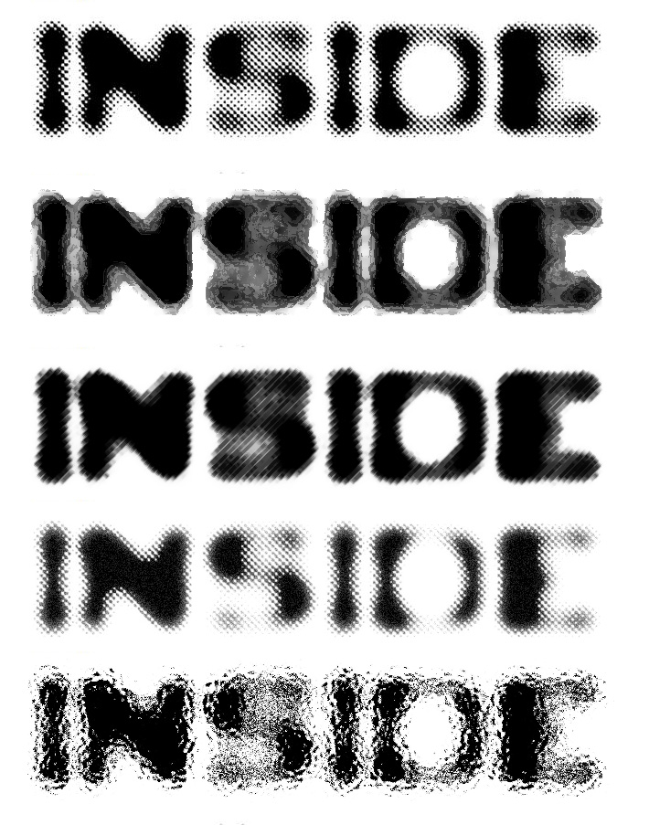
My contents page !
Here I present my contents page that I have created for my student magazine “INSIDE”. I tried to keep the same colour palette as I used on the front cover. Colours black, red and gray go together perfectly as they create a good contrast and attract attention of the readers. As you can see, my contents page is extraordinary and very unusual for a student magazine. I looked at the several contents pages of different school magazines as I came to a conclusion that they are all very similar and look the same. I also looked at some magazines which are focusing on fashion or music, etc. Some of them used different contents sheet. Contents page gives away what is this magazine about and how this information is presented is very important because contents page must attract the readers if the front cover did not. Therefore, I created a collage of different images which talk about what this issue of this magazine would be about (e.g. Kasabian concert, Christmas preparation, etc) and next to the pictures I put a little cover lines boxes where it says the title of the article and the page number where you can find. Most important and interesting articles stand out with the help of bigger bold font in order to attract attention. It might be a bit hard to read the content page in order; however the reader will automatically see the picture he would be interested in and he will see the page number next to it to help him find it in the magazine.Friday, November 25, 2011
FINAL DESIGN OF THE FRONT COVER PAGE

This is the final draft of my front cover page.
As you can see, I didnt put a lot of cover lines on it and I didn't use a banner.
I did not want to fill a lot of space on the front cover, because I personally prefer when there isnt much text on it, then I usually have the intention to open and read it.
However, I created few cover lines and they give away the titles of a few articles, which could be the most interesting ones
I used only two colours : white and red. First of all, the photo that was used as a background is really dark, therefore I had to use some bright colour to attract attention of the readers. Also white and red colours are symbolic for Christmas and this is issue would be coming out in December.
First draft of the front page

After producing several designs for the title I chose the one that has been chosen by participants of the questionnaire. I think also goes well with the actual photo that has been used for the front cover and it produces some particular style which teenagers might like.
Here I present my first draft of the front cover, it looks very good and stylish and I, therefore dont want to put too much on it, maybe few cover lines, a banner and thats it because I dont want to cover the photograph.
Thursday, November 24, 2011
the title : INSIDE
After looking at several ideas on the dafont website I used photoshop to edit and develop some of the ideas to make it look more interesting.
Please have a look and vote which one you like the most! thank you :)
Please have a look and vote which one you like the most! thank you :)
I provided several different ways of each idea :
1.

2.
3.
4.

5.

6.
Monday, November 21, 2011
Title ideas
After undertaking a survey and looking at different types of the titles for the student magazine, I came to a conclusion that the title "INSIDE" will be the best because it arouses curiousity of the readers and it suits the target audience. My target audience are students/teenagers who are likely to prefer something original and interesting. I used the website http://www.dafont.com/
photoshoot.part 2.
I also took some landscape pictures in order to show my variety of knowledge in the photography, pictures are still close ups, however I can't use them as a front cover pictures because picture presented on the front cover must be done as a portrait image. But if I would create a double spread page for some article inside the magazine here are the pictures that I would consider to use :


photoshoot.
Here i present some photographs I've taken for the cover of my student magazine, I chose the best out of all of them. This picture are portrait images and they could be used as a background image of my front cover.I'd be really grateful if you would help me to choose which one will be more suitable for the front page of my magazine.
I didn't use any editing or photoshop so far. I prefer black&white photography as it looks more dramatic and different. Pictures were taken in the very late evening outside, therefore it was really dark. I didn't use any artificial lighting apart from the one that I could avoid, e.g. lights from the street, windows and cars. I also didnt use very strong flash, because I dont like the effect of it as it makes the face of the model look really shiny. I took this picture with the camera Canon 550D on a manual mode. I prefer this mode the most because I can control everything and change the setting however I want. However, it was quite hard to catch a good light with this mode because as I mentioned earlier it was really dark outside. I asked my friend to pose for me and I chose him because I believe he is not scared of the camera and he is not trying to look fake on the pictures. Although he had some experience of working with some professional photographers and I personally took pictures of him before as well. I believe I achieved a good result as I'm happy with the pictures I've taken and hope I would be able to choose the best out of all of them and use it as a cover of my student magazine.


Subscribe to:
Posts (Atom)